
Have you ever been to this Motherfucking Website?
It's over-the-top satire, but there is a sobering truth behind it: modern websites have come really far from the simple HTML documents of old. Is it strictly for the better?
Web pages have grown to compete among themselves in different ways: one of which is to portray a unique aesthetic.
It makes sense in principle: if a document is more pleasing to look at, people are more likely to read it.
In this pursuit, however, Web pages have gone through stages upon stages of evolution, incrementally making more and more of some crucial trade-offs:
Bundle sizes in the megabytes are not only unheard of; they are the norm.
While a loading time of a few seconds might not sound that much, multiply that by the hundreds of times you visit a new Web page every day and it quickly adds up to a lot of wasted time.
And while there are ways to mitigate loading times despite large bundle sizes (although a lot of websites don't bother), it's still taxing to readers on metered connections, such as those on mobile data.
Modern Web pages tend to be bloated not only in a technical respect, but also a visual one.
How often have you seen a news site with the above design? Is this design truly meant to help the user read the article?
Several elements on the page compete for space and attention, to the point where the relevant information is relegated to the back seat. Funny, considering how that information is supposedly why the whole Web page even exists…
A lot of design elements designed for desktop do not translate well onto mobile, where space is more limited.
Modern Web pages solve this by taking extra effort to create mobile responsive designs, which usually means adding even more logic and bloat to the page.
Additionally, fancy Javascript-only features such as animations or interactables break for no-script users. These users do not comprise your average readership by any means, but the ones that do disable Javascript usually have a deliberate reason for doing so — perhaps for privacy or for performance — yet they get punished for it by inaccessibility.
These are solvable problems, but that's not the point; the point is that elements of modern Web design simply make it harder to be accessible, which is why you have these problems to deal with in the first place.
The Motherfucking Website brings us back to the reason we write Web pages to begin with: to share information.
Notice how each one of the trade-offs above actually sacrifice the accessibility of the content — the information — on the Web page, in return for a more unique aesthetic.
What a backwards decision to make! Very reminiscent of the logic vs. rhetoric narrative between Socrates and the Sophists.
The conclusion is clear: simplicity, in response to gluttony, is in service of the Web page's raison d'être.
Now, the Motherfucking Website paved the way for several follow-up responses (each seemingly more over-the-top than the last), but I particularly like the immediate successor: Better Motherfucking Website.
It retains much of the essence of the original thesis — that a Web page is first and foremost about the information — but also affords some focus into readability.
In fact, if you haven't noticed, this site's own styles are inspired from it.
Different aspects of this type of design directly provide a counterthesis to the problem, point per point:
While this Web page's CSS may not be the ultra-lean 7 lines like with Better Motherfucking Website, it still clocks in at the minimum 4KB.
That, paired with the fact that this whole website needs no Javascript files to run, means the page takes almost no time at all to load.
Take a look at this page's Lighthouse score:
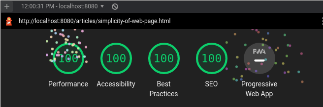
When was the last time you saw perfect 100s across the board on a modern website?
The reason why I like Better Motherfucking Website over the original Motherfucking Website is that the former pays attention to some niceties for readability.
A maximum body width, which in turn sets a maximum line width, helps make lines easier to parse than if they spanned the entire width of the screen.
A lower contrast also makes the page easier on the eyes, while at the same time keeping in mind the minimum recommended contrast level for accessibility purposes.
Most everything else is already handled nicely by the browser. For example, making proper use of the hierarchy of h1 through h6 headers means your Web page's header hierarchy will look clear and consistent by default — no font-size and font-weight meddling required.
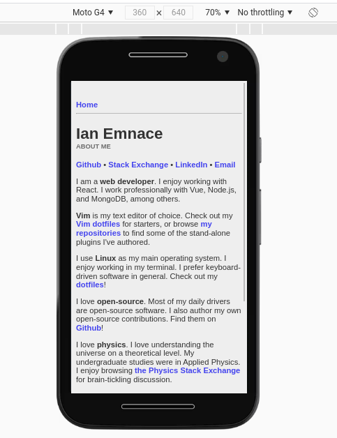
While mobile responsiveness can be effectively achieved in the modern Web thanks to media queries and frameworks, simple HTML documents actually enjoy responsiveness out of the box.
Additionally, the focus on HTML semantics means it also displays quite nicely on text-mode browsers such as w3m:
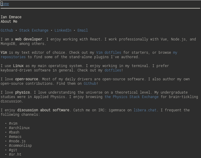
The latter may be overkill to consider (how large a percentage of the Web's average users will actually be using text-mode browsers?), but the fact is I didn't spend any additional effort to make it look nice on a text-mode browser at all.
I also regularly use a text-mode browser when going through my RSS feed, so having my website display properly for me is a pretty nice plus.
When I first got into Web development, the modern Web was already well underway.
Bootstrap templates and framework boilerplate had incrementally evolved to cover more and more use cases, and had eventually grown to be more computer-oriented than human-oriented.
It became a thing of the past to look at your Web application's HTML directly: instead you would work with a simpler templating language or a component-based UI tree.
Coming from such an environment, going back to writing simple HTML documents has been a refreshing change of pace.
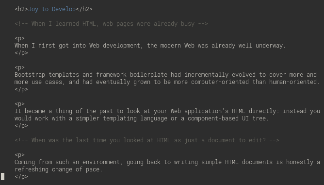
For the longest time, I had been using Markdown, both for writing short personal notes and for authoring longer documents (usually rendered to PDF via Pandoc).
However, working with such simple syntax (a short snippet of which appears above), writing HTML documents has honestly become a joy to do.
Without the visual noise of long strings of CSS classes and Javascript snippets, pure unadulterated HTML is actually comparable to Markdown in verbosity, while still retaining its full typesetting feature set.
At the same time, the emphasis on semantics over aesthetics has forced me to re-learn the discipline in selecting the right HTML for the job, which ultimately informs my Web development as a whole (even for Javascript projects using React or Vue).
Modern web development is in a good place right now, in terms of tooling philosophy. There had been a trend to move Javascript frameworks back to the server for server-side rendering and static site generation.
These trends have already caught on. Truly modern Web pages, built with modern technology, are well positioned to resolve a lot of the problems I lay out here.
This blog post, by exposition and demonstration, simply wants to put forth the same salient point as with Motherfucking Website: our problems with the Web are not fundamental, but are of our own design.
It's telling that we're coming full circle, with modern web tooling tending towards server-side rendering and static site generation, which were the de facto a couple of decades ago.
That said, there are still a lot of heavier-than-necessary websites out there, modern technology or not.
Company and marketing websites are a whole different space: tech companies judge each other on certain "standards" on what a company website must have (e.g. graphics, product and feature panels, etc). This at least we can concede — you're not convincing your boss any time soon that a radical revert to HTML documents is what your company website needs.
But for simple Web pages, blogs, and personal websites, where the primary goal is to convey information, we can do away with the problem of gluttony.